The hamburger menu was once a trend, but now it is just a vague little sandwich hiding everything users actually need. This sarcastic love letter reveals how a once-innovative icon became the Houdini of UX, making essential navigation disappear behind three plain lines. If your users feel lost in your menu, it may be time to ditch the burger.
Oh, Hamburger Menu. That mysterious little stack of lines. Once hailed as the sleek solution to cluttered navigation, you now feel like the flip phone of UX: retro, cryptic and slightly passive-aggressive.
Sure, you were cool back when screens were small, expectations were lower and users still clicked around like digital archaeologists.
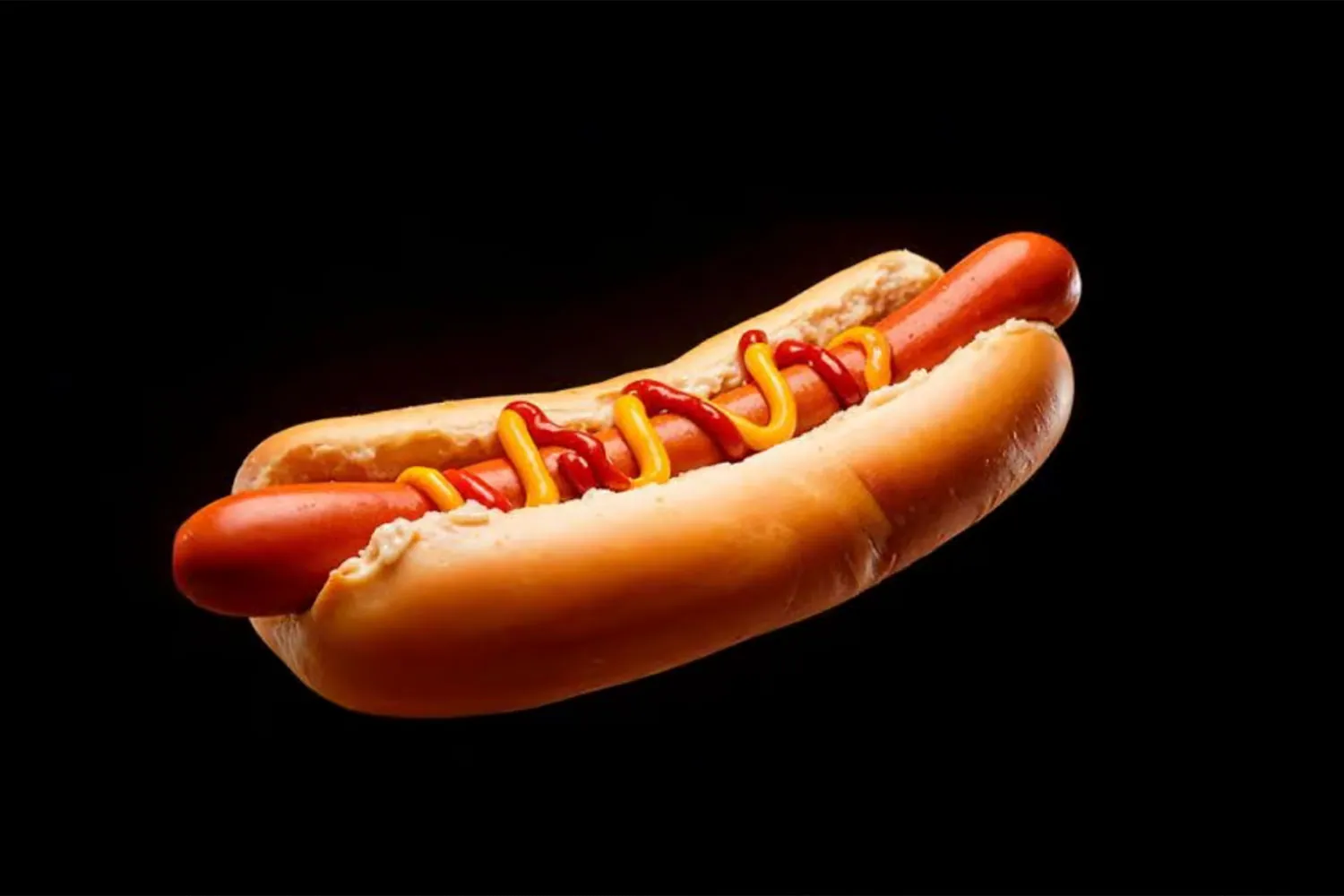
But now? Users have choices. Attention spans are shorter than your reveal animation. And guess what: they don't know what is behind you. They never did. Most people think you are just a weird logo. Or worse: a hot dog.
You hide the things people need, like navigation, account settings or "how do I get out of this mess?" You are like a magician's hat that forgot to produce the rabbit.
Meanwhile, tab bars are thriving. Sticky navigation is everywhere. Mega menus show off their information architecture like it is fashion week. And you? You are still hiding in the top-right corner like a shy ghost.
And don't get me started on accessibility. You alone have caused more rage clicks than a CAPTCHA on 2% battery.
Look, we had a good run. But it is time you stopped ignoring users and started giving answers instead of ellipses.
Maybe keep the three lines. Just lose the mystery.
Yours sincerely,
A designer tired of watching users get lost in a stack of sandwiches
So what should replace it?
That doesn't mean the hamburger menu must go entirely. The problem starts when everything important hides behind it. A few friendlier alternatives:
- A bottom tab bar: three to five main items always visible on phones, easy to reach with a thumb.
- A visible main menu on desktop: wide screens have plenty of room, so show the menu.
- Prioritise: show the pages people look for most, and put the rest in a secondary menu.
- Add a label: if you keep the icon, add the word "Menu" so its meaning is clear.
How to test it
Ask a few people to find specific information on your website, such as prices or contact details, and see how long it takes them. If many get lost, the navigation needs work. Analytics, such as how often the menu is opened, can help too.
Frequently asked questions
Is a hamburger menu bad for SEO?
Not directly, because Google can still read the links. The impact is on users: hidden pages tend to get fewer visits.
How do I put better navigation in place?
Start with the pages that matter most to your visitors. Our web design team can help design clear navigation for desktop and mobile.
 Yofie SetiawanFounder, Yopdesign